Skeuomorphism & Storytelling
Designers love to hate skeuomorphism. It’s just decoration. It’s completely useless. It will go out of style. Or as Mark Boulton, co-founder of Five Simple Steps, put it on twitter:
I really wish everyone would stop making digital things look like real things. A screen is not a drop shadowed, bevelled, wooden plank.
Yet Apple and many other software developers continue to use it heavily in some of their apps. Many hate without asking: Why? Why is Apple and so many others continuing down this path? They have all lost their sense of good design, surely. No?
There are some usability benefits with skeuomorphic design that are often touted. In iBooks, for example, Apple makes it obvious by using a book metaphor that you should swipe your finger over the pages to flick to the next page. Rubber banding – that nice little bouncy effect when you’re scrolling – is also very much skeuomorphism, though a subtle effect that has come to become loved by most. While these benefits of skeuomorphism are great, I want to talk about skeuomorphism that pisses people off; seemingly useless skeuomorphism that is almost solely used for decoration.
Paper is a drawing app for iPad by FiftyThree (made up of former Microsoft employees). It was recently released and made quite a splash. Here’s the first view you see when you launch the app:
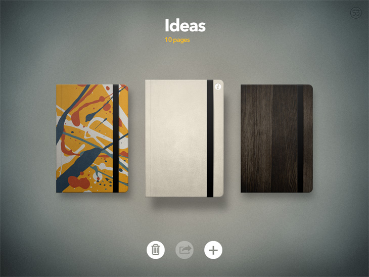
Books, blimey! This must be the decision of some designer that likes pushing pixels and creating photo realistic icons. He probably just wants to stroke his design ego and post screenshots on Dribbble. This has nothing to do with good software development.
Well, maybe it does.
Let’s look at the purpose of Paper. This is how FiftyThree pitches it on the App Store (emphasis mine):
Paper is where ideas begin. It's the easiest and most beautiful way to create on iPad. Capture your ideas as sketches, diagrams, illustrations, notes or drawings and share them across the web. […] Paper works the way you think, like a familiar notebook or journal. Have all of your ideas with you one one place.
It’s about capturing ideas. It’s quick and dirty. It is there for you to jot something down. It is basically a notebook. A drawing app could be anything, though, like a quick wireframing and sketching tool, or a tool for professional painters. However, Paper is not. The UI not only communicates that, but it helps you put yourself in a state where you feel free to express ideas without evaluating them. The UI tells a story and sets a mood for the entire experience.
This is the home screen of Brushes, a drawing app for iPad that has been used to create no less than four covers for The New Yorker:
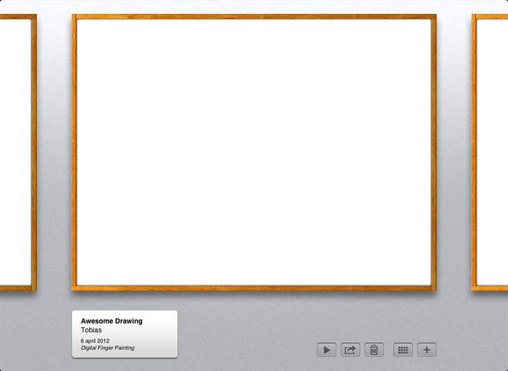
This interface tells a completely different story. If I want to spend an hour or two realizing one of my ideas, this interface would inspire me. If I’m out to take some quick notes, this interface may however discourage me from doing so. I don’t want my quick, ugly notes to be framed in and put up on a wall for display. I would think twice before quickly jotting down anything in this app.
The functionality of Paper and Brushes are basically the same, yet the perceived purpose is totally different.
In Snow Leopard, Photo Booth looked like this:
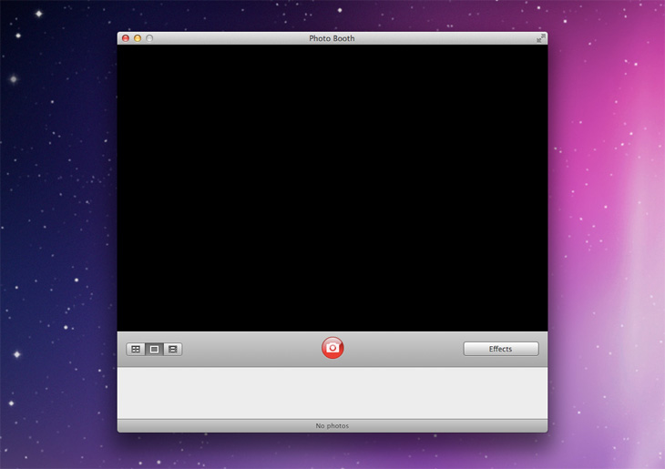
Then came Lion, and fullscreen mode. Now here comes the skeuomorphism train:
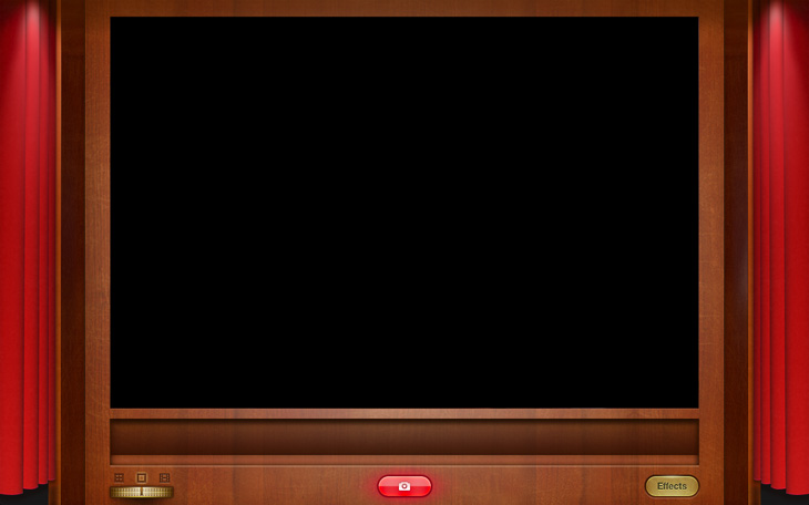
Boom! Curtains. Wooden panels. Metal buttons. Really Apple?
Again, let’s look at the function of Photo Booth: take pictures, record videos and apply filters to them. The first version of Photo Booth made all this really easy and accessible. It did not, however, communicate the purpose of Photo Booth: fool around and have fun. Let me demonstrate:
Photo Booth is a digital toy. The first version of Photo Booth, however clean and functional, did not look like a toy. It wasn’t fun, and it didn’t encourage you to play around with it. In the new fullscreen mode, Apple uses skeuomorphism to invite users to play.
Skeuomorphism is about communcating and reinforcing feelings – getting an application to become a memorable experience, not just a tool. It’s about communicating the purpose of a UI, not only the functions it enables.
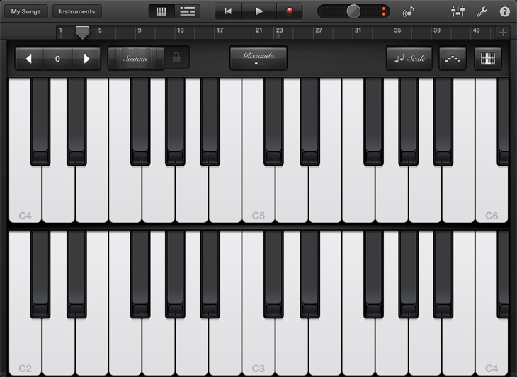
Playing music should be fun, right? There’s a very good reason Garageband for iPad looks like this:
And not like this:
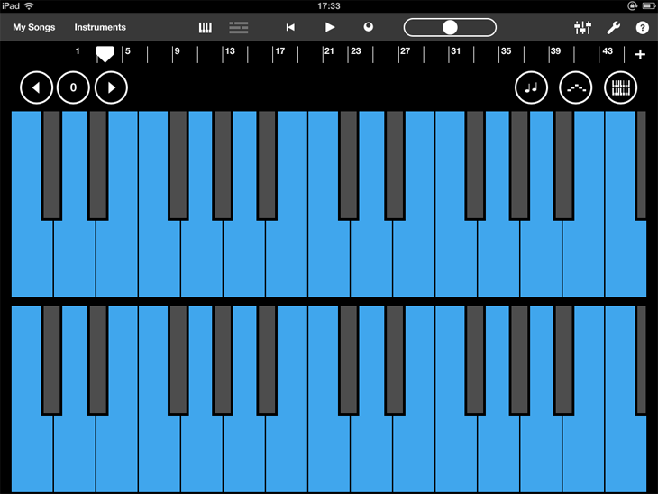
And that is just taking away the realism. Removing skeuomorphism would leave us with something like this:
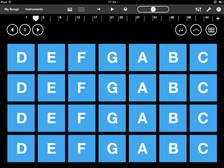
While this may be more functional, more clean, and more “true to the functions of the interface”, it’s not fun. I could as well be creating music in Excel. Apple’s Garageband interface not only presents features in a clear and understandable way, it adds to a beautiful, fun and memorable experience.
Skeuomorphism is a powerful tool. You shouldn’t be afraid to use it, but you should be careful. It probably doesn’t belong, for example, in a productivity app like Mail. Some might say Apple has crossed the line with some apps, like with the Calendar app in Lion, or the Find My Friends app for iPhone and iPad.
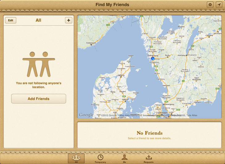
This may be true, but consider the purpose of Find My Friends. It’s not about stalking your acquaintances, your colleges or your employees. It’s about staying in touch with your friends. The interface looks, to be frank, quite silly. But it’s also extremely friendly. The app’s functionality is quite controversial, and framed differently – like a serious productivity app – it could easily be perceived as outright creepy.
Josh Clark, in his book Tapworthy:
Don't dismiss this as touchy-feely hokum: an emotional vibe is the basis for all marketing and storytelling, and make no mistake, your app is in fact a story. In the very personal context of the iPhone, people think about an app as content more than "software", an experience more than a tool, and entertainment more than a task. Your app's personality sets the mood of that experience and it has to suit its audience as well as the job at hand. When you marry the aesthetics of a thing to both its function and its owner, you get something that is beautiful, functional and distinct.
It is often said that design should be invisible. More importantly, design should empower. An interface that is not only easy to use, but fun to use, engages the user and creates an experience where obstacles are easier to overcome, and thus an experience where the product is easier and more effortless to use. Done right, skeuomorphism can retain the simplicity and ease of use of an interface while empowering users to act.
